
GTA market update
July 2026 still a buyer's market, but a narrowing one
Real estate markets don't usually change direction overnight, they evolve through a series of small shifts, and understanding those shifts is often more valuable than focusing on a single news headline.

- Months of inventory
- 4.6
- Average price
- $1,003,956
- Sales
- 5,995
- New listings
- 14,484
July's MLS sales numbers reinforce that idea. Buyers continue to benefit from choice, negotiating power, and favourable conditions, yet the supply of homes coming to market continues to shrink. The result is a market that still favours buyers, but one that's gradually becoming more balanced than it was earlier this year.
The numbers also remind us why broad GTA averages only tell part of the story. Detached and condominium values continue to vary dramatically from one municipality to another, creating very different opportunities depending on your budget, property type, and location.
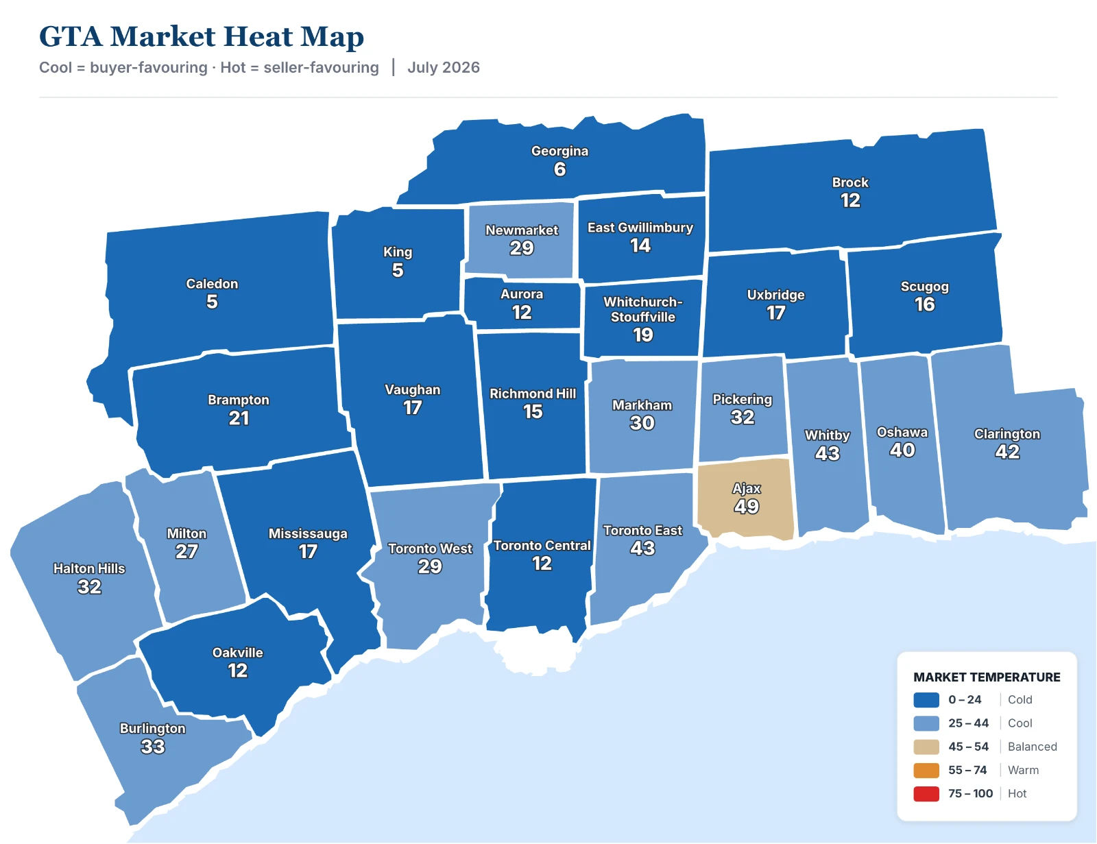
No two GTA markets are exactly alike. This above heat map provides a quick snapshot of how each municipality is performing based on buyer demand, available inventory, and the pace at which homes are selling.
Think of it as a market temperature map. Cooler blue areas generally indicate markets where buyers have more negotiating power, while warmer colours represent markets moving closer to balanced conditions or, in some cases, favouring sellers.
Behind this map are measures such as the Sales-to-New-Listings Ratio (SNLR), which compares the number of homes sold with the number of new listings coming onto the market, and Months of Inventory (MOI), which estimates how long it would take to sell all current listings if no new homes were added. Together, these indicators help us understand the balance between supply and demand.
The July data reinforces an important point: there is no single "GTA market." Durham, Toronto, and Halton are generally closer to balanced conditions, while Peel and York continue to offer buyers greater negotiating power. Local market conditions matter far more than regional averages.
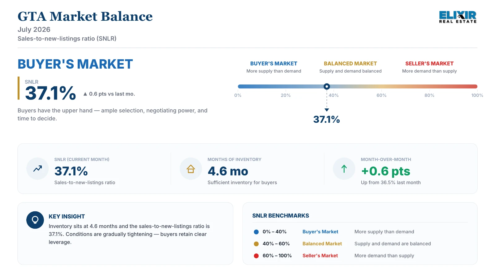
The above chart shows the overall balance of the GTA housing market. At 37.1%, the GTA remains comfortably in buyer's-market territory, giving buyers plenty of choice, negotiating power, and time to make well-informed decisions. The encouraging sign is that the market balance has improved by 0.6 percentage points since last month. It's only a modest change, but it suggests the market is gradually moving toward greater balance while still offering favourable conditions for buyers.
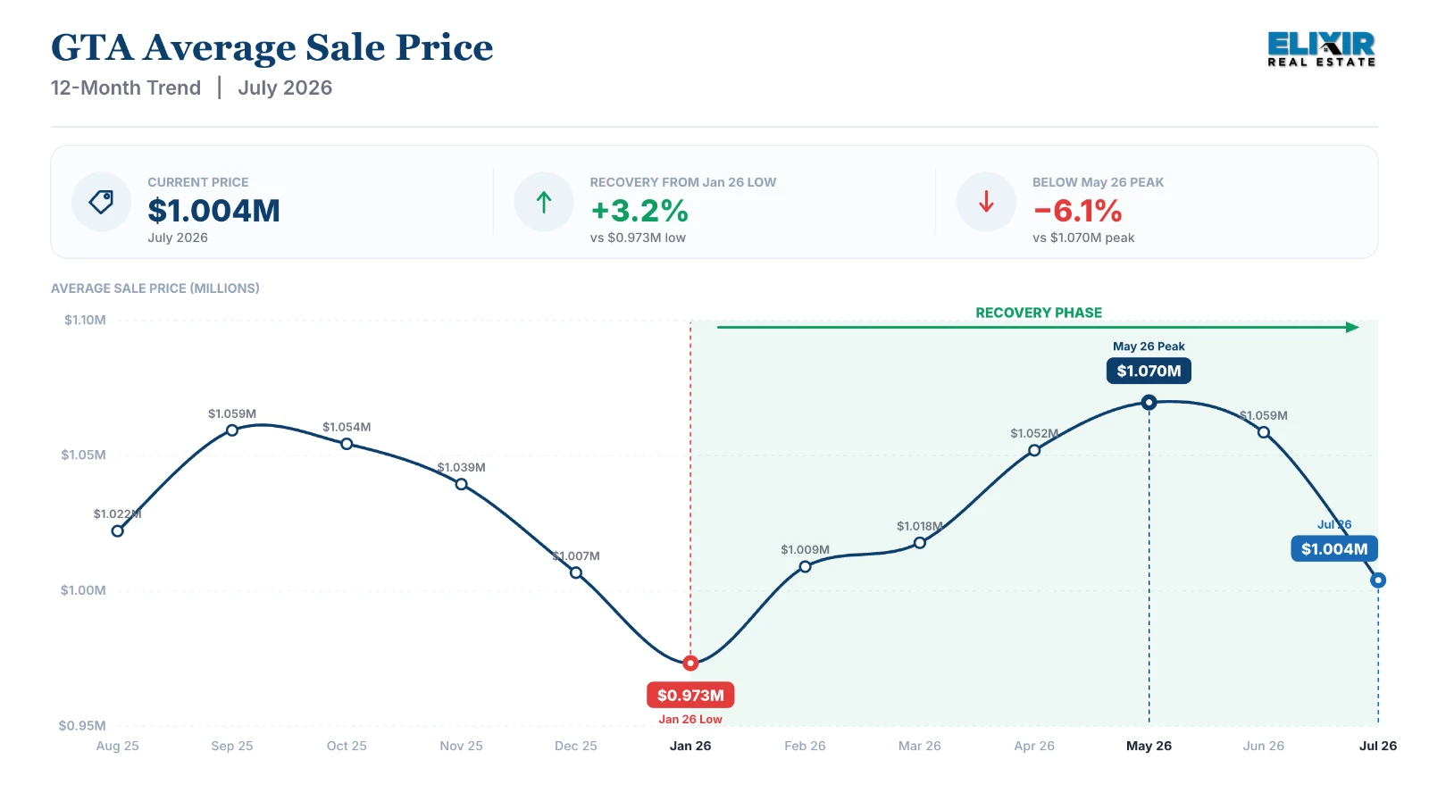
This 12-month price trend reminds us why it's important not to focus on just one month's data. We've seen a modest seasonal cooldown following the spring market, which is fairly typical. Even so, the average GTA sale price remains approximately 3.2% above the January low. Markets rarely move in a straight line, and looking at the broader trend often provides a much clearer picture than any single month's headline.
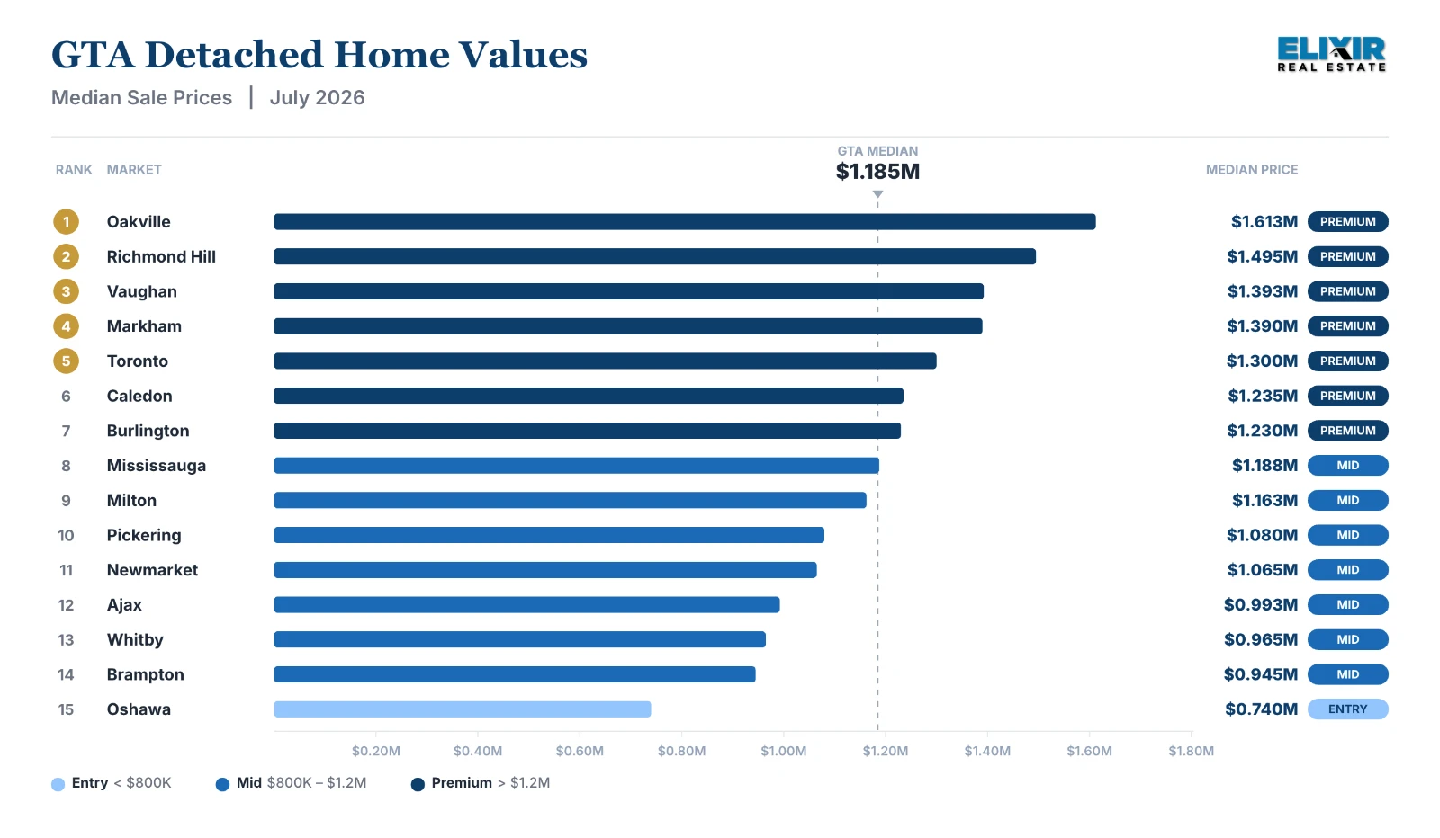
GTA Detached Market Overview: Rather than asking which municipality is the most expensive, I think a better question is which market best fits your goals. Every city across the GTA offers a different balance of affordability, lifestyle, commute, and long-term potential. Whether you're buying your first home, moving up, downsizing, or investing, understanding these local differences often creates better opportunities than simply following the GTA average. That's why real estate remains, and always will remain, a local market.
The GTA average describes almost nowhere
The region came in at 37.1%. Underneath that, King sat at 20.8% with 11.6 months of inventory and homes taking 55 days to sell, while Burlington reached 45.7% with 3.6 months. In Oshawa and Toronto East, homes sold at or above asking on average.
Most room to negotiate
- King20.8%
- Caledon29.7%
- Georgina29.7%
- Richmond Hill33.1%
- Brampton33.3%
Tightest
- Burlington45.7%
- Ajax45.6%
- Whitby43.5%
- Clarington42.2%
- Toronto East41.4%
Every municipality, ranked
The same 27 municipalities as the table below, ordered by sales-to-new-listings instead of by region. 21 of 27 sat below the 40% line that conventionally marks a buyer's market.
By region
Regional ratios are recalculated from total sales and total new listings, not averaged across municipalities — averaging ratios would weight Brock the same as Toronto Central.
| Region | Sales | New listings | Active | SNLR | Months of inventory |
|---|---|---|---|---|---|
| Durham | 725 | 1,719 | 2,579 | 42.2% | 3.6 |
| Halton | 682 | 1,503 | 2,659 | 45.4% | 3.9 |
| Peel | 1,053 | 2,875 | 5,055 | 36.6% | 4.8 |
| Toronto | 2,242 | 4,980 | 9,310 | 45.0% | 4.2 |
| York | 1,063 | 2,764 | 5,179 | 38.5% | 4.9 |
Every GTA municipality, July 2026
All 27 municipalities TRREB reports on. Sorted by region — the ranked extremes are above.
- Buyer's market · under 40%more coming to market than leaving it
- Balanced · 40–60%neither side has the upper hand
- Seller's market · over 60%competition for what is listed
| Municipality | Sales | New listings | Average price | Median price | Sales to new listings | Months of inventory | Sold vs asking | Days on market |
|---|---|---|---|---|---|---|---|---|
| Durham | ||||||||
| Ajax | 111 | 227 | $907,336 | $872,500 | 2.9 | 99% | 25 | |
| Brock | 12 | 38 | $692,917 | $685,000 | 6.1 | 96% | 26 | |
| Clarington | 132 | 295 | $753,919 | $727,845 | 3.1 | 98% | 25 | |
| Oshawa | 177 | 449 | $693,677 | $663,000 | 3.5 | 100% | 26 | |
| Pickering | 98 | 259 | $951,065 | $910,000 | 3.8 | 98% | 29 | |
| Scugog | 31 | 68 | $894,776 | $860,000 | 5.0 | 97% | 34 | |
| Uxbridge | 23 | 60 | $1,152,885 | $1,034,500 | 5.3 | 98% | 31 | |
| Whitby | 141 | 323 | $894,257 | $857,500 | 2.9 | 98% | 27 | |
| Halton | ||||||||
| Burlington | 221 | 428 | $1,050,887 | $940,000 | 3.6 | 96% | 37 | |
| Halton Hills | 66 | 159 | $968,388 | $878,500 | 3.9 | 97% | 29 | |
| Milton | 147 | 341 | $944,889 | $890,000 | 3.9 | 97% | 32 | |
| Oakville | 248 | 575 | $1,412,619 | $1,182,500 | 5.0 | 96% | 38 | |
| Peel | ||||||||
| Brampton | 498 | 1,277 | $885,702 | $840,000 | 4.9 | 98% | 28 | |
| Caledon | 55 | 210 | $1,230,122 | $1,110,000 | 6.8 | 95% | 36 | |
| Mississauga | 500 | 1,388 | $899,002 | $860,000 | 4.9 | 97% | 32 | |
| Toronto | ||||||||
| Toronto Central | 1,120 | 2,569 | $1,107,537 | $737,500 | 5.2 | 96% | 36 | |
| Toronto East | 554 | 1,126 | $885,625 | $839,000 | 3.6 | 101% | 27 | |
| Toronto West | 568 | 1,285 | $942,284 | $831,900 | 4.3 | 98% | 31 | |
| York | ||||||||
| Aurora | 62 | 163 | $1,301,811 | $1,175,000 | 4.9 | 95% | 34 | |
| East Gwillimbury | 47 | 106 | $1,042,536 | $1,050,000 | 5.3 | 97% | 33 | |
| Georgina | 61 | 199 | $886,967 | $778,000 | 6.2 | 96% | 40 | |
| King | 20 | 88 | $2,028,099 | $1,770,000 | 11.6 | 94% | 55 | |
| Markham | 288 | 704 | $1,131,324 | $1,062,500 | 4.2 | 99% | 32 | |
| Newmarket | 82 | 194 | $966,817 | $895,000 | 4.2 | 98% | 27 | |
| Richmond Hill | 182 | 523 | $1,222,748 | $1,150,000 | 5.6 | 99% | 37 | |
| Vaughan | 272 | 647 | $1,144,631 | $1,065,000 | 4.9 | 97% | 34 | |
| Whitchurch-Stouffville | 49 | 140 | $1,125,840 | $1,088,000 | 4.9 | 97% | 42 | |
Source: Toronto Regional Real Estate Board (TRREB), July 2026, all home types. Sales-to-new-listings under 40% is generally read as a buyer's market, over 60% a seller's.
Before I sign off, I'd like to leave you with a short thought that I believe rings true in both real estate and life: "The beginning is always today."
Thank you for taking the time to read this month's update. I look forward to connecting with you soon.
Where these numbers come from
Figures are Toronto Regional Real Estate Board (TRREB) data for July 2026, covering all home types. Sales-to-new-listings compares homes sold against homes newly listed in the month: below 40% is generally read as a buyer's market, above 60% a seller's, and between the two as balanced. Months of inventory is how long the current listings would last at the month's pace of sales, if nothing new came on. Full definitions of every term ↓
A month is a snapshot, not a trend, and a municipality is not a neighbourhood — the street matters more than the city line. Ask us what it means where you are, or work out the numbers on your own move with the calculators.
Terms & definitions
How to read these numbers
The measures behind every monthly report, in plain language. The thresholds are the conventional ones the industry uses — stated here so you are never asked to take them on trust.
- SNLRSales-to-new-listings ratio
The share of a month's new listings that actually sold. It is the single quickest read on market balance — whether buyers or sellers hold the upper hand.
- Below 40%Buyer's market
- 40–60%Balanced
- Above 60%Seller's market
- MOIMonths of inventory
How long it would take to sell every active listing at the current pace of sales, if no new homes came to market. Lower means homes sell faster and sellers have more leverage.
- Under 2Strong seller's market
- 2–4Seller's market
- Over 6Buyer's market
- SP/LPSale-to-list price ratio
The percentage of the asking price a home actually sold for. It tracks how much room buyers have to negotiate — or whether homes are selling over asking.
- Above 100%Sold over asking
- 98–100%Near asking
- Below 98%Room to negotiate
- DOMDays on market
How long a home takes to sell once listed. Lower means homes are moving quickly once priced right; higher points to buyers taking their time.
- Under 14Fast-moving
- 14–30Normal pace
- Over 30Slower / buyer's conditions
- HPIHome Price Index
A measure of price change for a "typical" home of consistent quality and size. Unlike the average, it is not distorted when the mix of homes sold shifts — more condos one month, more detached the next.
More reliable than average price for tracking true market direction month to month.
- YoYYear over year
Compares a figure to the same month a year earlier — July against last July, not against June. It strips out seasonal patterns, so a change reads as a real market shift rather than the calendar.
Sales up year over year while new listings fall is the classic sign of a tightening market.
- BoC rateBank of Canada overnight rate
The rate at which major banks lend to each other overnight, set by the Bank of Canada. It drives the prime rate and variable mortgage rates — the main lever the Bank uses to cool or stimulate the economy.
Lower rates → cheaper mortgages → more buyers → upward pressure on prices.
These describe the market. What a move costs you is a different question — the calculators work out land transfer tax, closing costs and what a lender will actually approve.
Get it monthly
The same figures, with what we make of them, sent once a month. No listings pushed at you, and one click to stop.